Pantone Mocha Mousse vs Our Signature Pebble – A Colour Trend We Called Early
Posted by BC SoftWear on 23rd Apr 2025

Pantone Mocha Mousse vs Our Signature Pebble – A Colour Trend We Called Early
Posted by BC SoftWear on 23rd Apr 2025
Our timeless Pebble shade shares striking similarities with Pantone’s Mocha Mousse – here’s why it’s the perfect neutral for luxury spaces.
Pebble Perfection: When timeless style meets trendsetting instinct
Every year, the design world waits with bated breath for the Pantone Color Institute™ to reveal its Colour of the Year – a shade that reflects the global mood and creative direction. In 2025, they announced a soft, warm tone that feels comfortingly familiar here at BC SoftWear, because we’ve been championing this very shade for quite some time.
PANTONE 17-1230 Mocha Mousse, say hello to BC SoftWear’s Pebble.
A neutral shade with warm undertones, Pebble is the kind of colour that instantly makes a space feel calm, luxurious and welcoming. It’s modern without being cold; natural, without being rustic. And now, it turns out, it’s also bang on trend.
To arrive at their selection each year, the Pantone Color Institute’s global team of colour experts comb the world looking for new influences, which can stem from the latest films, art collections, technologies and materials to all areas of design. Anything and everything can influence the Pantone Colour of the Year … we wonder if one of the team paid a visit to Maidenhead?
At BC SoftWear, Pebble has been a quiet staple across our most popular luxury collections – from plush towels and sumptuously soft robes to bespoke spa linens. It’s a colour that has always resonated with the needs of high-end spas and five-star hotels: soft enough to blend effortlessly into minimalist interiors, but distinctive enough to carry a premium, considered look.
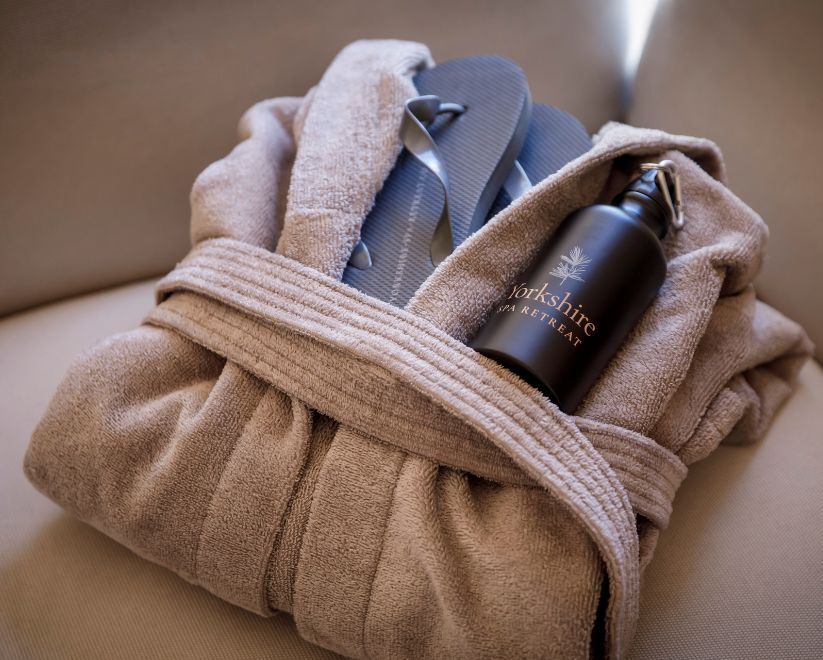
Courtesy of Yorkshire Spa Retreat - Pebble SupremeSoft Bathrobe
Why Pebble Works in Luxury Interiors
One of the reasons Pebble has become a signature shade for BC SoftWear is its incredible versatility across both colour and material palettes. Whether you're creating a minimalist spa setting or a layered hotel suite with bold design features, Pebble acts as the perfect anchor.
For a calm, harmonious look, pair Pebble with other soft neutrals like ivory, stone or taupe. This palette works especially well in spa treatment rooms, where the aim is to reduce visual noise and create a cocoon of calm. Add natural textures like raw wood, rattan or brushed cotton to enhance the earthy, organic feel.
If you're working with a more luxurious, high-contrast space, Pebble can hold its own against richer tones. Try it alongside deep navy, forest green or even black marble for a moodier, boutique hotel vibe. Gold and brass fittings also complement Pebble beautifully, warming the tone and adding a touch of opulence without overwhelming the design.
When it comes to texture, Pebble offers a premium look across all of our textiles – from the crisp, professional feel of our SupremeSoft™ robes to the plush density of our Serenity towels. Because the shade is understated, it allows the quality of the fabric itself to shine through, drawing attention to softness, weight and detail.
Whether used across treatment rooms, poolside areas or guest bathrooms, Pebble brings a sense of softness and balance that enhances the overall experience for clients and guests alike.
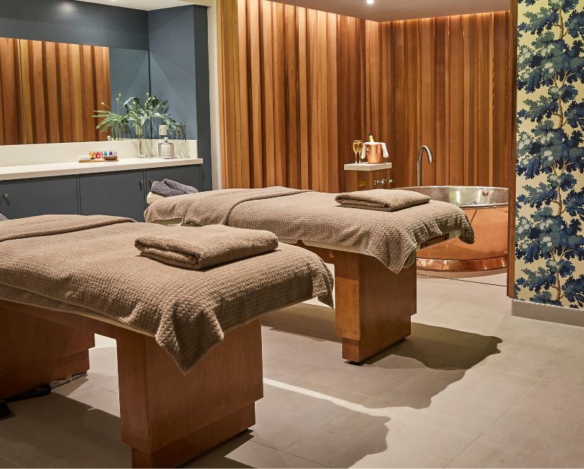
Courtesy of Rudding Park - Serenity Waffle Treatment Towels in Pebble
Consistency Across Touchpoints – From Spa to Suite
One of the often-overlooked benefits of a versatile colour like Pebble is the ability to create a unified aesthetic across every touchpoint in your guest journey. From the moment a client checks into their room to their treatment experience in the spa, using consistent tones like Pebble helps reinforce your brand identity.
It’s subtle, but powerful – a guest wrapped in a Pebble bathrobe by the pool feels the same calm continuity as when they step into a Pebble-accented bathroom or treatment suite. This cohesion speaks volumes about attention to detail and reinforces a sense of curated, effortless luxury.
Global Design Relevance – From London to the Maldives
Pebble also travels well. While some colours can feel location-specific, Pebble’s understated neutrality makes it an ideal fit for a wide range of interior styles – whether it’s a contemporary London spa, a Provençal countryside retreat or a Maldivian overwater villa.
It adapts beautifully to local materials, lighting and moods. This global flexibility means our clients can roll out a cohesive look across multiple locations without losing the essence of their regional personality.
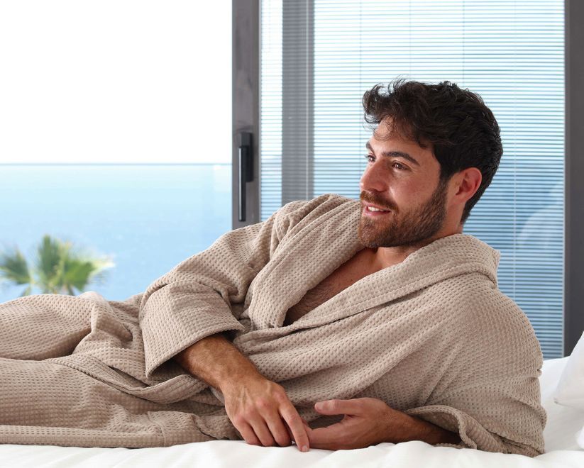
Serene Bathrobe in Pebble
Not About Trends – But Lovely to Be Ahead of Them
Choosing Pebble was never about chasing trends – it was about creating a timeless look that blends warmth with understated luxury. Still, it’s satisfying to see our instincts reflected by global colour authorities like Pantone.
Want to see how Pebble works in a real-world setting? Explore our Pebble collection or speak to our team to find out how this timeless shade can elevate your space.